Highlight

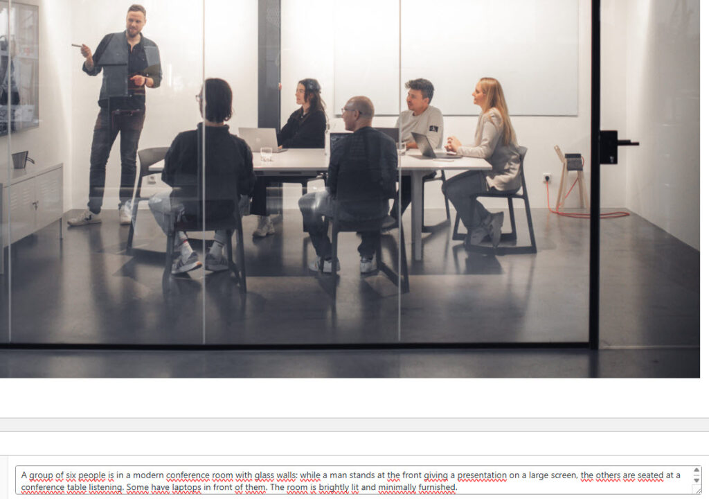
Successful together – our valantic Team.
Meet the people who bring passion and accountability to driving success at valantic.
Get to know usJune 10, 2025

Online accessibility is more important than ever, as businesses work to create websites that are easier to navigate for users with physical disabilities.
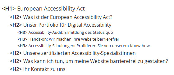
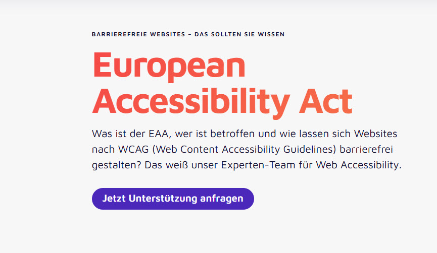
One of the main reasons this is especially relevant now is the upcoming European Accessibility Act (EAA). It sets specific requirements for new products and services entering the market from June 28, 2025. A later deadline applies to existing products and services. The EAA aims to enhance accessibility across Europe by ensuring that products and services are usable by all.
But what are the most common challenges that limit accessibility? In this article, we highlight five frequent barriers and explore how addressing them can significantly improve the user experience and overall accessibility of your website.
Alternative texts, or ALT texts, are short descriptions that convey the content of images or graphics. They allow individuals with visual impairments to understand visual information using screen readers. When key information is presented only through images without ALT texts, this content becomes inaccessible.
However, not every image needs an ALT text. For purely decorative visuals, it’s important to mark them correctly so that assistive technologies can skip them, reducing unnecessary distractions.
But there’s more: Maintaining accurate and descriptive ALT texts not only supports users with disabilities but also improves your website’s SEO. They help search engines like Google better understand your content, which can boost your rankings.
Also keep in mind: ALT texts aren’t limited to websites – they’re equally important for images used in emails and on social media platforms.
Website information and structure should be both visually clear and technically identifiable.
This requires:
When these structural elements are missing, assistive technologies struggle to interpret the content. For example, a form field without a label will be read simply as “input field” by a screen reader, leaving users unsure what information is required. This creates a significant barrier, especially for blind users who rely on screen readers to navigate and complete forms independently.
Imagine trying to read the latest news on your favorite newspaper’s website while sitting in direct sunlight. Poor contrast ratios can make this nearly impossible. While moving to a shaded spot may solve the issue for some, people with visual impairments don’t have that simple workaround.
Maintaining proper contrast ratios for text, buttons, icons, and graphics ensures that your content remains accessible to all users.
Specifically, the guidelines call for:
If your company logo falls short of these contrast requirements, don’t worry! You don’t have to adjust your CI guidelines – logos are exempt from these accessibility standards.
Many users navigate websites using only a keyboard. For them, it’s crucial that all content can be accessed through keystrokes and that it follows a logical, predictable order – moving through headings, links, forms, and buttons in sequence. If the focus suddenly jumps from a menu to the bottom of the page or to a hidden element, users can quickly become disoriented.
In e-commerce, poor focus management or inaccessible elements, such as an inaccessible “buy” button, can prevent users from completing their purchase – leading to abandoned carts and lost sales opportunities.

Every website and its pages should have descriptive titles. Clear titles help users quickly distinguish between pages – especially when multiple tabs or bookmarks are open. Ideally, the title should include both the company or brand name and a reference to the page’s content. For example, “Content Management | valantic Austria” is far more helpful than simply “Content Management.”
Clear titles help all users but are especially valuable for users of screen readers, allowing them to identify the purpose of a page without needing to navigate through its content.
And don’t forget: Descriptive titles aren’t just for web pages – they’re equally important for documents like PDFs!
Website accessibility starts with the basics: descriptive alternative texts, clear structure, and sufficient contrast. For users with disabilities to navigate your site independently, content must be properly labeled and presented in a logical order.
The benefits go beyond accessibility – enhancing usability can also improve your SEO performance and increase conversion rates.

Curious about how accessible your website really is?
We specialize in digital accessibility and can provide a comprehensive audit to uncover barriers and guide you in removing them.

Customer Experience July 16, 2026
From Segments to Individual 1:1 Relevance: What Hyperpersonalization Means in Retail
Personalization is high on the retail industry’s agenda, but so far, it has been viewed primarily as a technical capability. AI is currently changing both expectations for personalized experiences and the technical means of delivering true one-to-one relevance. That is what hyperpersonalization ultimately comes down to: personality and context that build trust, credibility, and loyalty.
From Segments to Individual 1:1 Relevance: What Hyperpersonalization Means in Retail
Customer Experience July 9, 2026
Customer Centricity in B2B: How Manufacturers are meeting rising Customer Expectations
Customer centricity is also essential in the B2B environment in order to build long-term relationships. But how can true customer centricity be achieved and how can the ROI be measured? Practical tips and a real-life project example show how manufacturing companies use customer centricity as a growth and competitive advantage.
Customer Centricity in B2B: How Manufacturers are meeting rising Customer Expectations
Artificial Intelligence June 25, 2026
AI Potential in Manufacturing: Which Use Cases are already live – and what pays off?
In the manufacturing industry, AI is already one of the most important technologies. Yet there is a significant gap between ambition and productive use with measurable results. Where will AI be worthwhile in the manufacturing industry in 2026, and which use cases are already making its potential tangible today?
AI Potential in Manufacturing: Which Use Cases are already live – and what pays off?Don't miss a thing.
Subscribe to our latest blog articles.